Table of Contents
Footer
The footer object supports custom control buttons, e.g. home, back, next, save, etc. If no footer object is specified, then the default control is used.
buttons
buttons is text which specifies which buttons should be shown on the footer toolbar.
| type | name | bind::ct:footer.buttons |
|---|---|---|
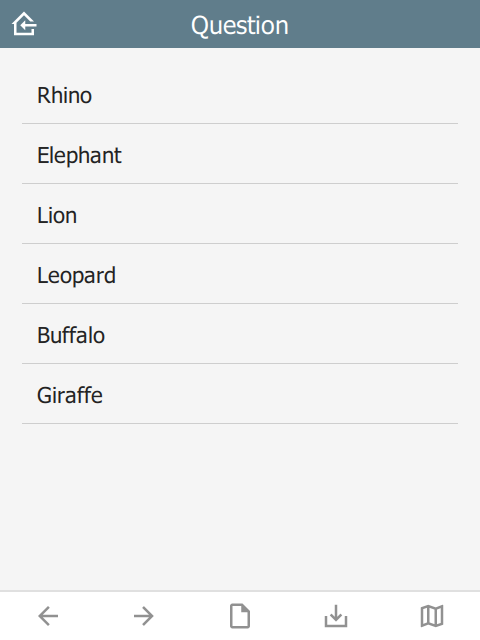
| select_one | animal | back next index save map |
| surveychoicessettings | ||
 |
home button
The home button returns to the Home page. In immersive mode, this returns to the Projects page, otherwise it returns to the project home page.
back button
The back button navigates to the prior question on the form. If the wizard is at the start of the form, the back button is hidden.
next button
The next button navigates to the next question on the form. If there is no next question, then the next button is hidden.
save button
The save button will attempt to save the current sighting. If the sighting has invalid data, then the Index page will be shown with invalid fields highlighted.
nextOrSave button
The nextOrSave button will show as a next button unless there are no more questions, in which case it will become a save button.
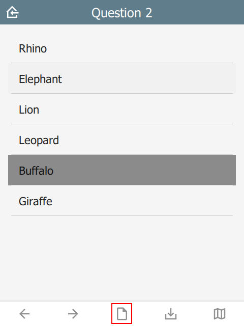
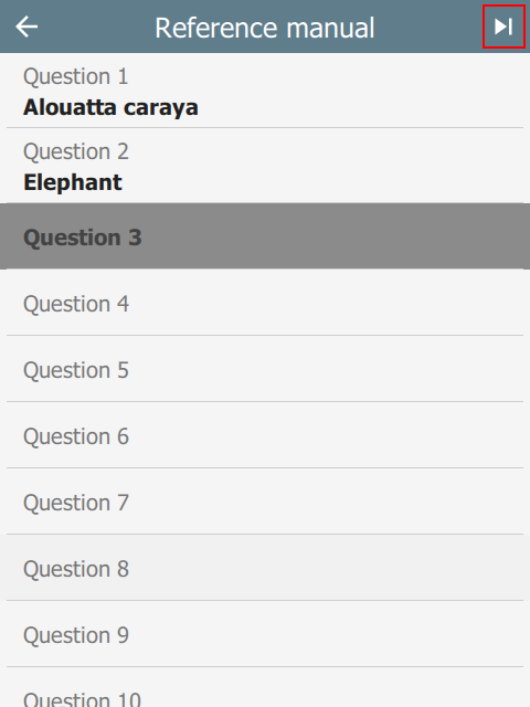
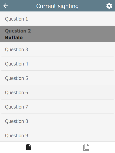
index button
The index button displays a list of all the form questions. Selecting a question will navigate the wizard to it directly. A jump-to-last button on the top right of the header will jump to the next required question. If all required questions are filled in, then it jumps to the last question.
 |  |
options button
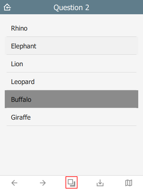
The options button is only available in immersive mode. In non-immersive mode, it becomes the index button (see above).
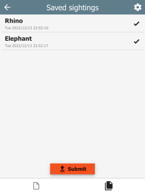
The options button shows an options page with two tabs: current sighting and saved sightings:
 |  |  |
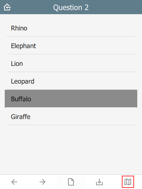
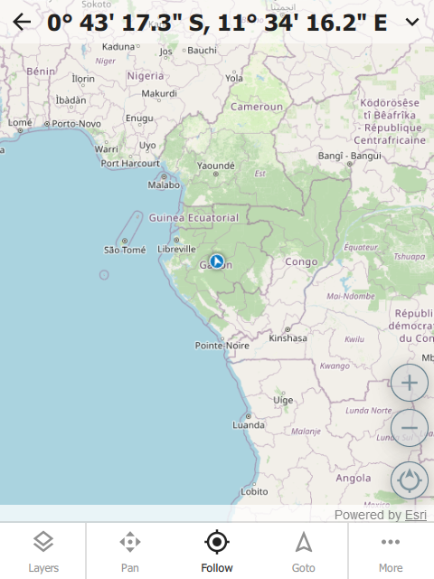
map button
The map button opens the map dialog.
 |  |
Custom button icons
The button icons can be overridden with custom ones. To do this, create columns with the name of the button followed by Icon. For example:
- homeIcon
- backIcon
- nextIcon
- saveIcon
- indexIcon
- optionsIcon
- mapIcon
| type | name | bind::ct:footer.mapIcon |
|---|---|---|
| select_one | animal | my_custom_map_icon.svg |
| surveychoicessettings | ||
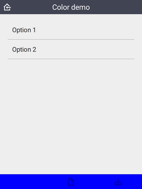
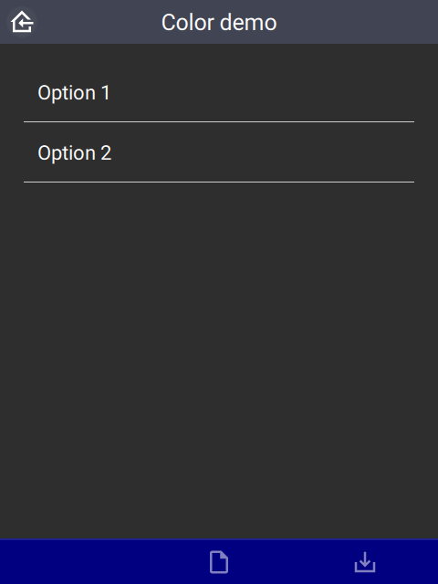
color and colorDark
By default, the footer background color is taken from the settings sheet. However, it is possible to override it on an individual page.
| type | bind::ct:footer.color | bind::ct:footer.colorDark |
|---|---|---|
| select_one... | #0000ff | #000080 |
| surveychoicessettings | ||
 |  |
buttonColor and buttonColorDark
Override the default button color with a custom one. This applies to all buttons.
| type | bind::ct:footer.buttonColor | bind::ct:footer.buttonColorDark |
|---|---|---|
| select_one... | #00a000 | #20f020 |
| surveychoicessettings | ||
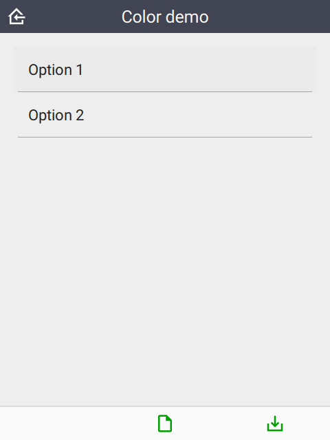 | 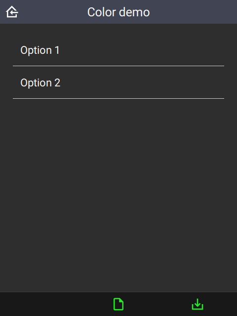 |
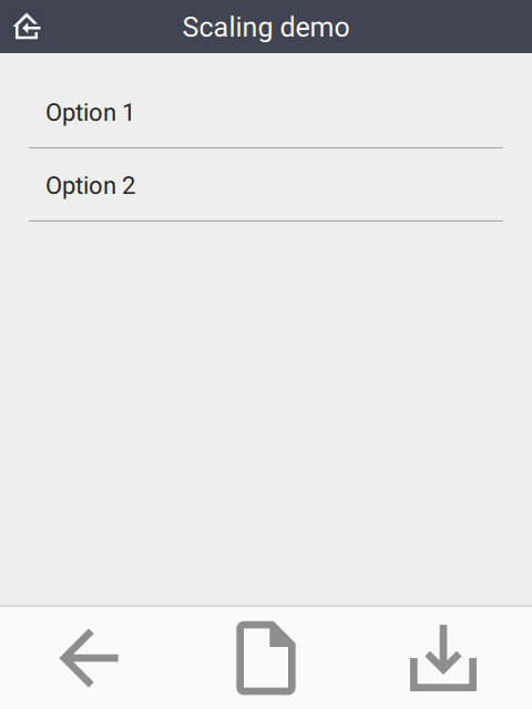
buttonScale
An additional scaling factor to apply to the button size. This is typically useful for increasing the size of footer buttons. The scaling factor will be capped to allow at least 6 buttons to fit in the footer.
| type | bind::ct:footer.buttonScale | |
|---|---|---|
| select_one... | 3.5 | |
| surveychoicessettings | ||
 |
hidden
If yes then the footer is hidden. Default is no.
| type | name | bind::ct:footer.hidden |
|---|---|---|
| select_one animal | animal | no |
| surveychoicessettings | ||
qml
A QML fragment to use instead of the built-in footer. See Developer section. For example:
| type | name | bind::ct:footer.qml |
|---|---|---|
| integer | animal_count | qml fragment |
| surveychoicessettings | ||
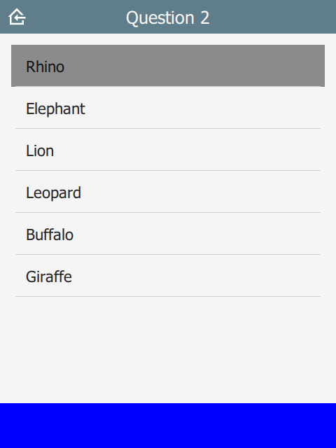
To set the footer to a blue rectangle, replace qml fragment above with the following:
import QtQuick 2.15

Rectangle {
    color: "blue"
    height: 64
}
 |
qmlBase64
Base64 encoded QML (see qml above).
qmlFile
Name of a QML file which exists alongside other project files. This is not supported on ODK or KoBoToolbox, but can be used in Survey123.