Table of Contents
Content
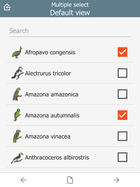
The content section is the middle part of the screen between the header and footer. By default it automatically selects a control for the question type, e.g. a date selector for a date question. By specifying a custom content object, more styles are available. This is especially useful for customizing lists.
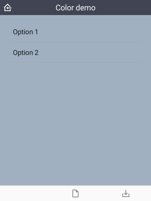
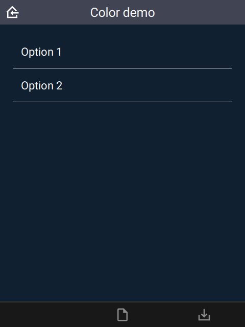
color and colorDark
By default, the content background color is taken from the settings sheet. However, it is possible to override it on an individual page.
| type | bind::ct:content.color | bind::ct:content.colorDark |
|---|---|---|
| select_one... | #a0b0c0 | #102030 |
| surveychoicessettings | ||
 |  |
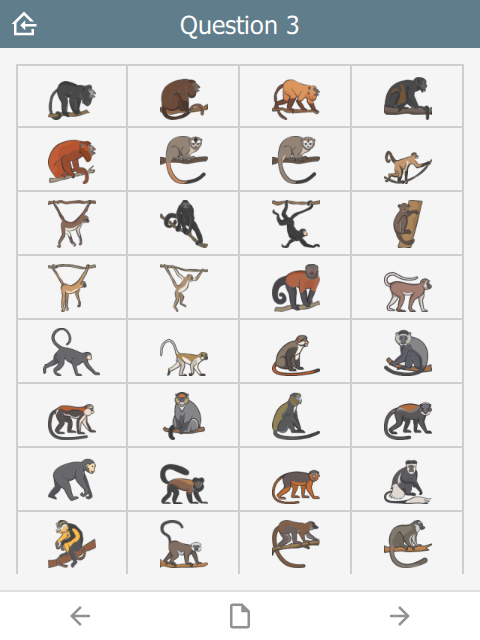
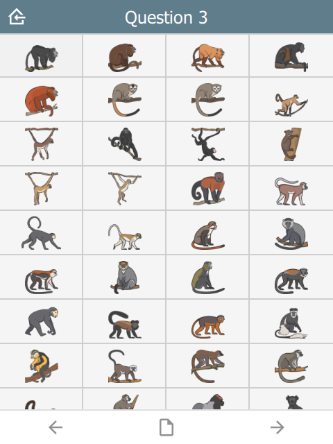
frameWidth
Frame width around the content area of the page. Default is 16.
| type | name | bind::ct:content.frameWidth |
|---|---|---|
| select_one animal | animal | 0 |
| surveychoicessettings | ||
In this case, frameWidth was set to 0 in the second image.
 |  |
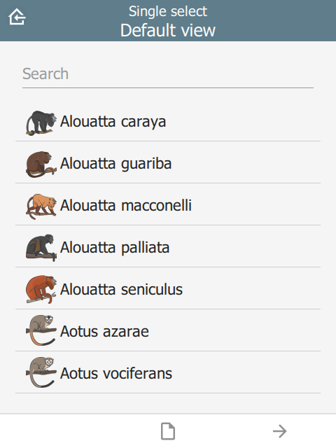
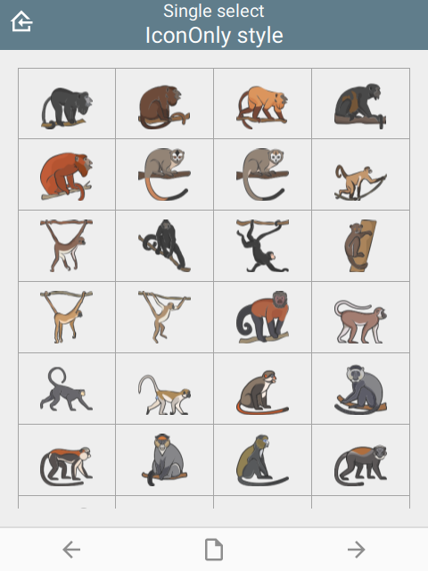
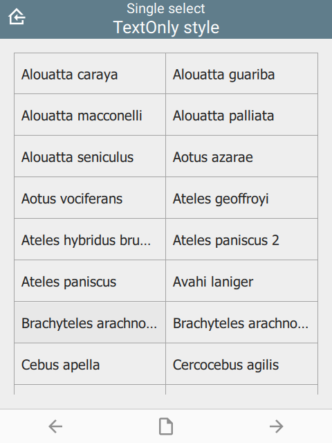
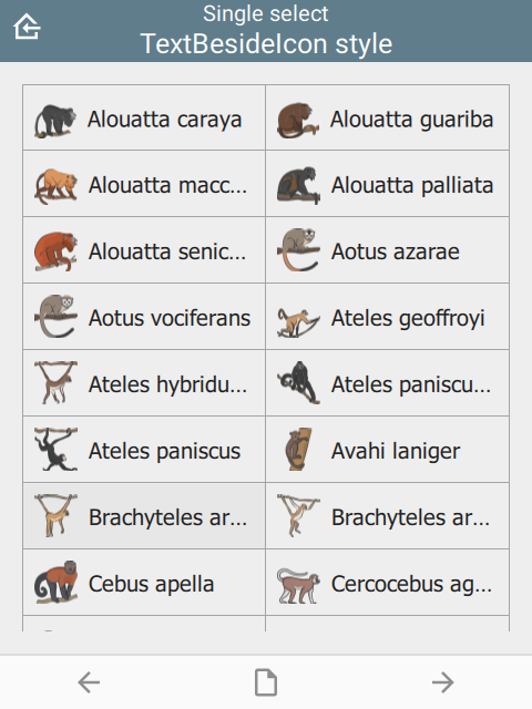
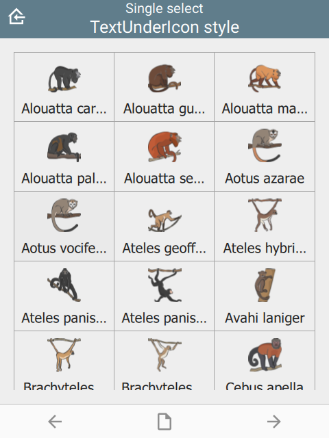
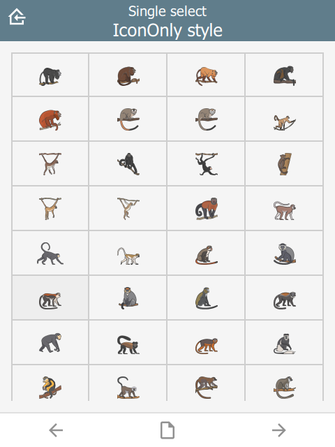
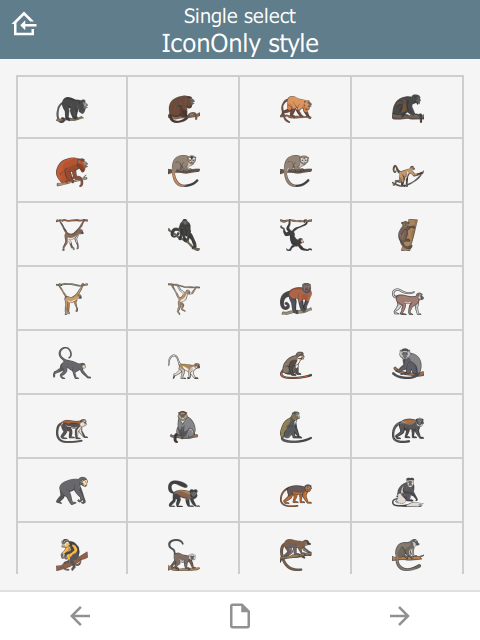
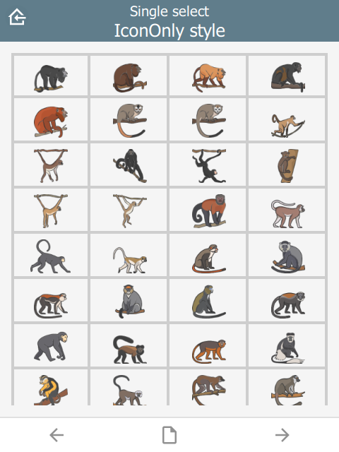
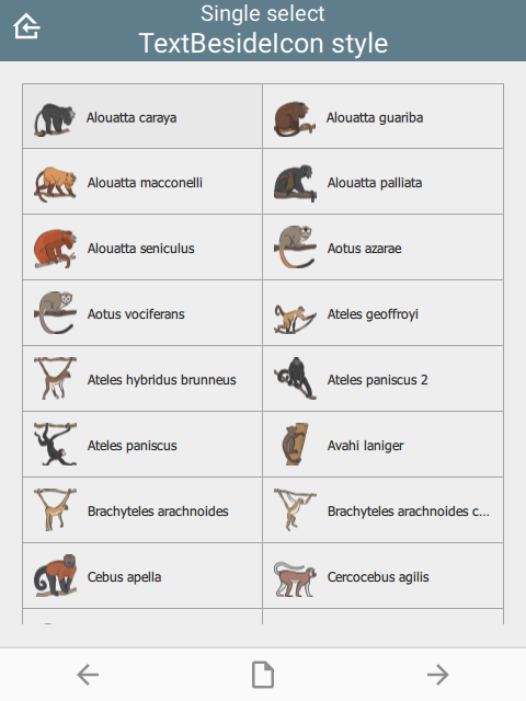
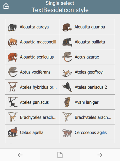
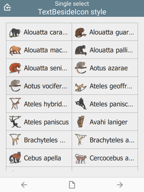
style
The visual appearance of the question.
| type | name | bind::ct:content.style |
|---|---|---|
| select_one animal | animal | IconOnly |
| surveychoicessettings | ||
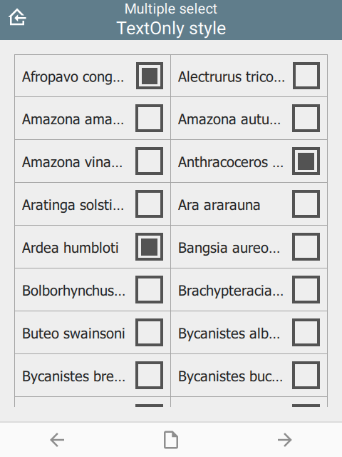
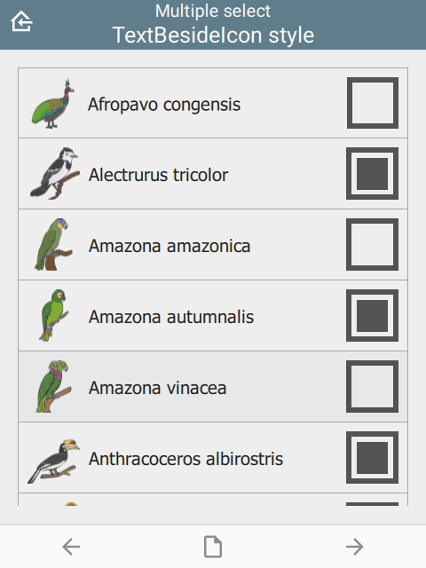
For select_one questions
- (not specified)
- IconOnly
- TextOnly
- TextBesideIcon
- TextUnderIcon
 |  |  |
 |  |
For select_multiple questions:
- (not specified)
- IconInlay
- IconOnly
- TextOnly
- TextBesideIcon
 | 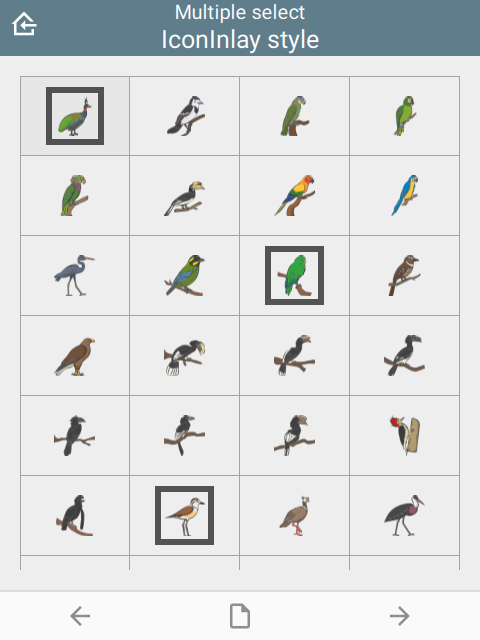 | 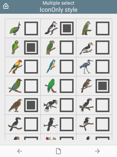 |
 |  |
For number list groups:
- (not specified)
- IconOnly
- TextOnly
- TextBesideIcon
Number lists are a set of questions inside a group. The appearance column must be set to field-list to force all group questions to appear on the same page:
| type | name | label | bind::ct:content.style | appearance |
|---|---|---|---|---|
| begin group | numberlist | Number list | IconOnly | field-list |
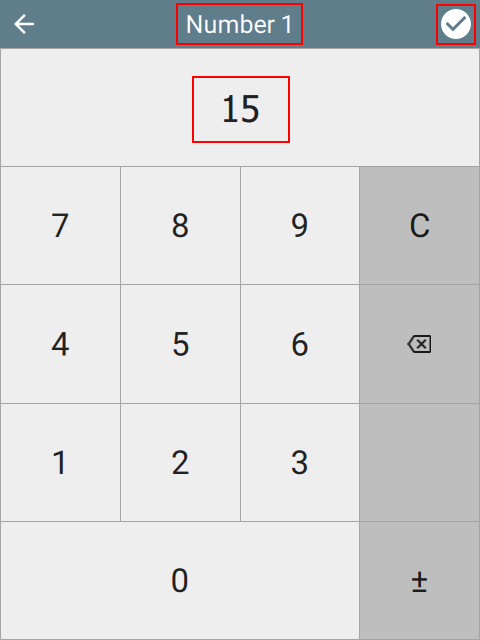
| integer | number1 | Number 1 | ||
| integer | number2 | Number 2 | ||
| integer | number3 | Number 3 | ||
| integer | number4 | Number 3 | ||
| integer | number5 | Number 5 | ||
| end group | ||||
| surveychoicessettings | ||||
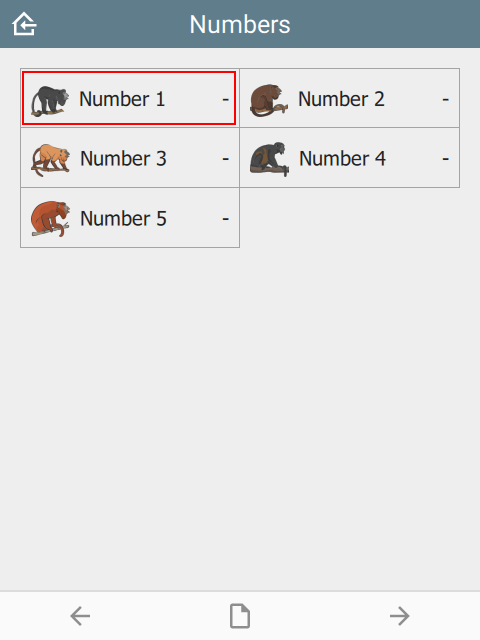 |  | 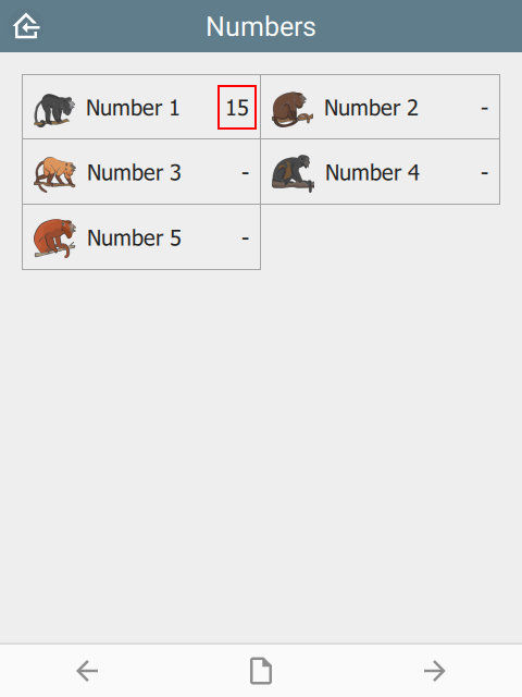 |
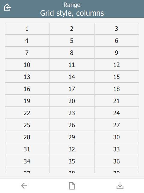
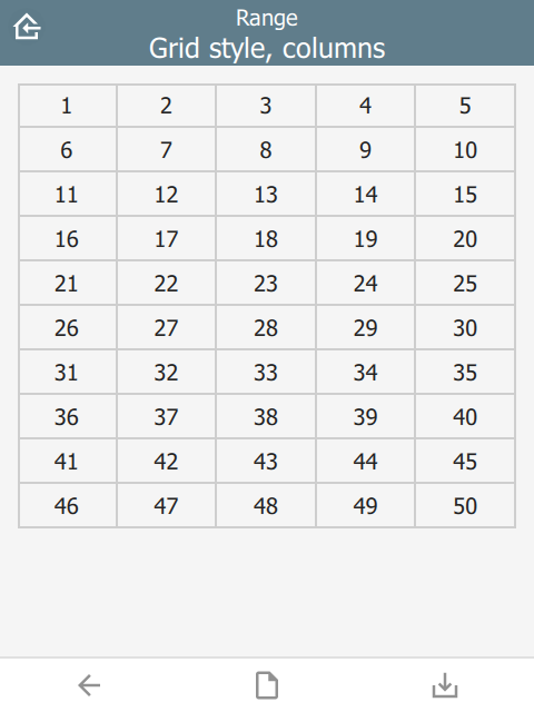
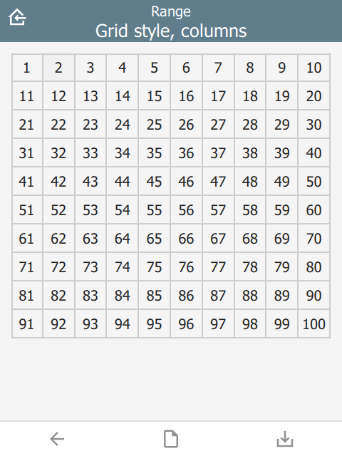
For range questions:
| type | name | parameters | bind::ct:content.style | bind::ct:content.columns |
|---|---|---|---|---|
| range | animal_count | start=1 end=100 step=1 | Grid | 5 |
| surveychoicessettings | ||||
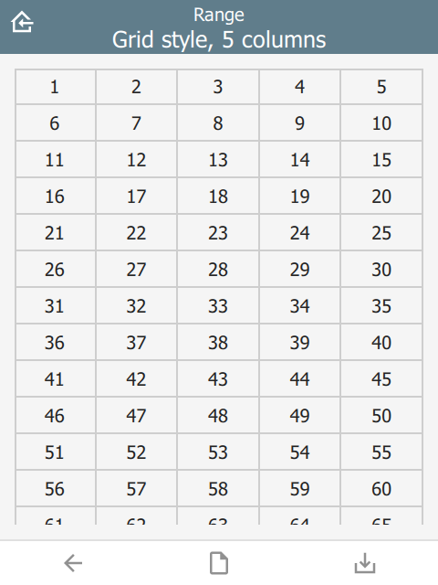 |
For a fixed number of image questions:
| type | name | label | bind::ct:content.style | appearance |
|---|---|---|---|---|
| begin group | photogroup | Group photos | Grid | field-list |
| image | image1 | Photo | ||
| image | image2 | Photo 2 | ||
| image | image3 | Photo 3 | ||
| image | image4 | Photo 4 | ||
| end group | ||||
| surveychoicessettings | ||||
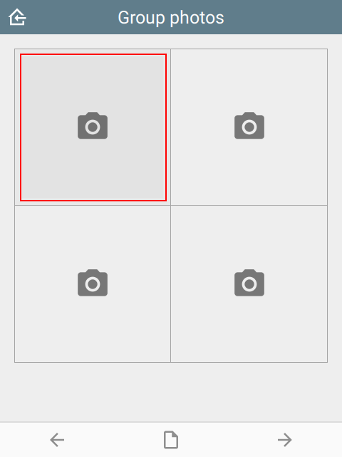 | 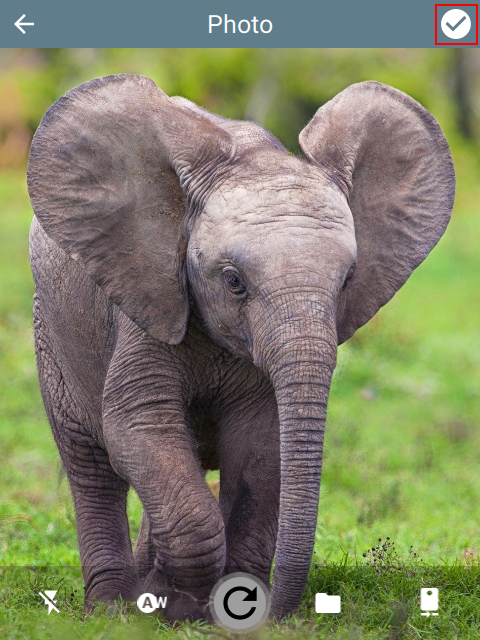 | 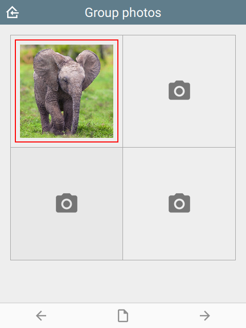 |
For a dynamic number of image questions:
| type | name | label | bind::ct:content.style |
|---|---|---|---|
| begin repeat | photogroup | Repeat photos | Grid |
| image | image | Photo | |
| end repeat | |||
| surveychoicessettings | |||
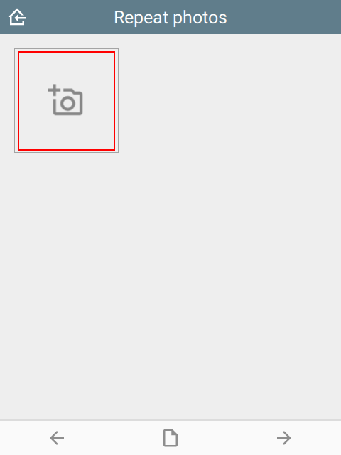 |  | 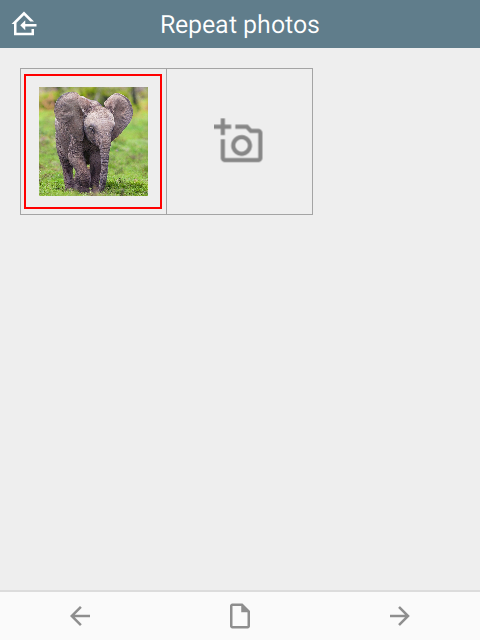 |
Ignored for other question types.
padding
The padding space between grid items. Requires style to be set.
| type | name | bind::ct:content.padding |
|---|---|---|
| select_one animal | animal | 8 |
| surveychoicessettings | ||
Padding values are 0, 4 and 8.
 |  |  |
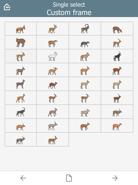
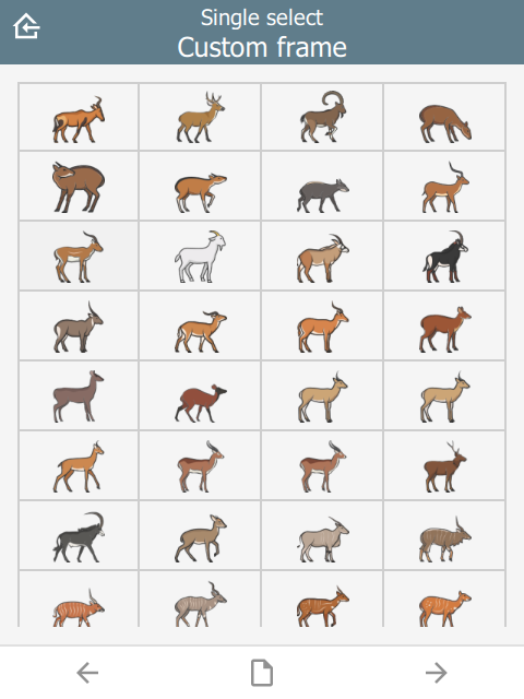
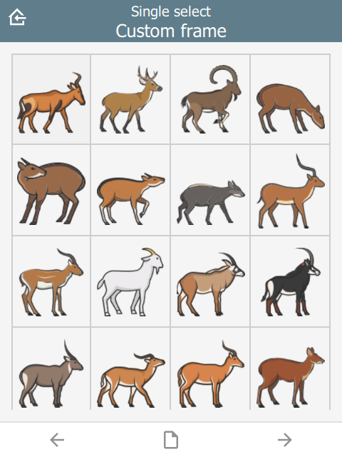
columns
Number of columns for grids. Requires style to be set. Defaults to 2.
| type | name | bind::ct:content.style | bind::ct:content.columns |
|---|---|---|---|
| select_one animal | animal | Grid | 4 |
| surveychoicessettings | |||
For example, column values below are 3, 5 and 10.
 |  |  |
lines
Show lines between cells for grids. Requires style to be set. Defaults to true.
| type | name | bind::ct:content.style | bind::ct:content.lines |
|---|---|---|---|
| select_one animal | animal | IconOnly | no |
| surveychoicessettings | |||
lines value below is yes and no.
 |  |
border
Show border around the outside of a grid. Requires style to be set. Defaults to no if frameWidth is 0, yes otherwise.
| type | name | bind::ct:content.style | bind::ct:content.border |
|---|---|---|---|
| select_one animal | animal | IconOnly | yes |
| surveychoicessettings | |||
Border value is yes and no.
 |  |
borderWidth
Border width for grid lines. Requires style to be set. Defaults to 2.
| type | name | bind::ct:content.style | bind::ct:content.borderWidth |
|---|---|---|---|
| select_one animal | animal | IconOnly | 2 |
| surveychoicessettings | |||
borderWidth value is 2 and 4.
 |  |
fontSize
Size text font size. Requires style to be set. Defaults to 16. Note that the font is subject to scaling according to the Font size in the main Settings page.
| type | name | bind::ct:content.style | bind::ct:content.fontSize |
|---|---|---|---|
| select_one animal | animal | IconOnly | 14 |
| surveychoicessettings | |||
fontSize values are 10, 14 and 18.
 |  |  |
fontBold
Set font to bold. Requires style to be set. Defaults to false.
| type | name | bind::ct:content.style | bind::ct:content.fontBold |
|---|---|---|---|
| select_one animal | animal | IconOnly | yes |
| surveychoicessettings | |||
itemHeight
Set height of individual items. Requires style to be set. Defaults to 48.
| type | name | bind::ct:content.style | bind::ct:content.itemHeight |
|---|---|---|---|
| select_one animal | animal | IconOnly | 48 |
| surveychoicessettings | |||
itemHeight values are 48, 64 and 128.
 |  |  |
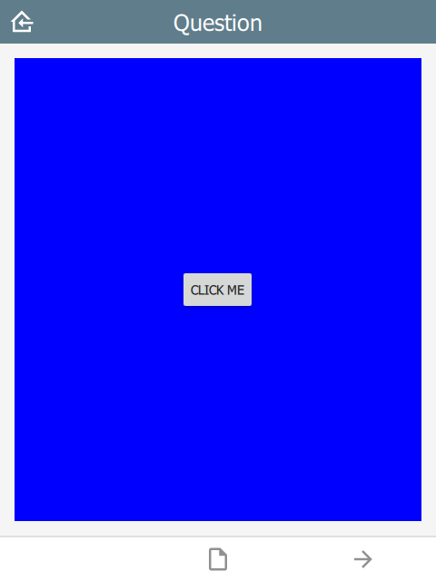
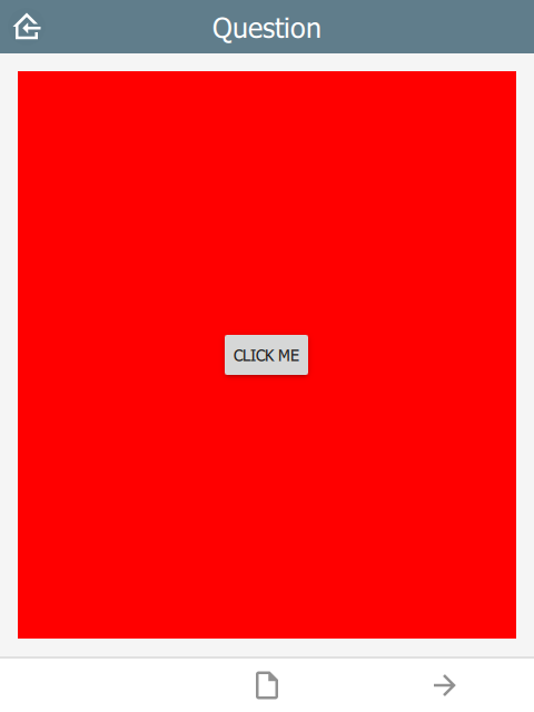
qml
A QML fragment to use instead of the built-in content. See Developer section. For example:
| type | name | bind::ct:content.qml |
|---|---|---|
| integer | animal_count | qml fragment |
| surveychoicessettings | ||
To set the content to a blue rectangle, replace qml fragment above with the following:
import QtQuick 2.15
import QtQuick.Controls 2.15

Rectangle {
    color: "blue"
    Button {
        anchors.centerIn: parent
        text: "Click me"
        onClicked: parent.color = "red"
    }
}
In the example, the content is blue, then changes to red when the button is clicked.
 |  |
qmlBase64
Base64 encoded QML (see qml above).
qmlFile
Name of a QML file which exists alongside other project files. This is not supported on ODK or KoBoToolbox, but can be used in Survey123.